-

Alnour
Project 2022
-
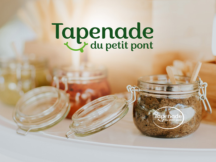
Tapenade du petit pont
Project 2022
-

Daryo
Project 2022
-

Melea Cosmetics
Project 2022
-

ORBIS
Project 2022
-

Benty
Project 2022
-

Firm
Project 2022
-
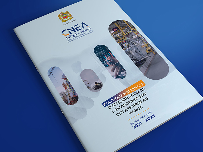
CNEA
Project 2021
-

FNM Rabat
Project 2021
-

Union européenne
Projet 2020
We were approached to define the visual identity and graphic language for the institution. The logo consists of a monogram and typeface designed for APMM. The typographic design, stable, thick and structured, has graphic accidents that give it a certain singularity. The Apmm monogram, playing on the counterform, positions the institution as much as a point of rapprochement, in a sensitive and subtle way.
-
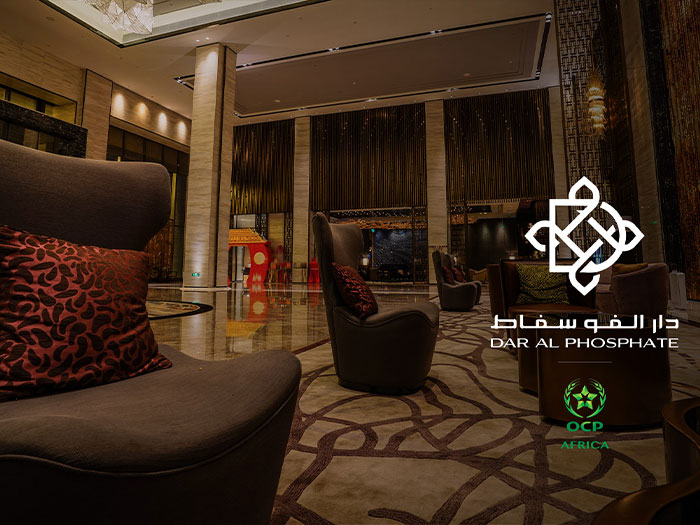
Dar Al Phosphate
Projet 2020
Following a consultation, OCP turned to Graffity studio for the complete creation of its Dar Al Phosphate visual identity. During a close collaboration of more than 4 months, we worked on a graphic language of the brand by developing a rich and structured visual system. based on an original typography, subtly emerges and comes in a Monogram 'D' + 'Dal' (in Arabic) it unfolds subtly identifying the identity of statutory and timeless way by adding the door symbol of Moroccan art and architecture, the ensemble provides the typographic block with a sought-after balance, navigating between art and luxury.
-
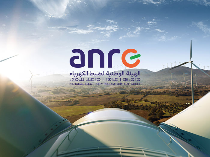
ANRE - National Electricity Regulatory Authority
Projet 2020
The first phase of the branding that we worked on was presented to the actors of the project and to the elected members of the management board of the Ministry of Energy and Mines. The ANRE logo is an original typographic creation. Composed of high-case, thick and solid characters, it includes a symbol within the design of the letters, The initial "E" character has been modeled to look like a switch regulator referring to both "electricity" and "Energy"
-

Promomarbre groupe
Projet 2020
We worked with the founders, to develop the visual identity. The logo, a typogram entirely designed for the company Promomarbre, is a statutory lettering comprising subtle graphic lines transforming into a bold "PM" monogram, it reveals the simplified design of the marble slices.
-

Ryad Mogador
Projet 2020
We were commissioned to create the visual identity of the Hotel Ryad Mogador in Liège, Belgium. The logo, based on a refined and elegant typographic symbol designed by our artistic direction, surrounded by the handcrafted doors which highlights in a simple and subtle way the character "RM". The graphic universe and underlined on the print variations by a set of colors.
-
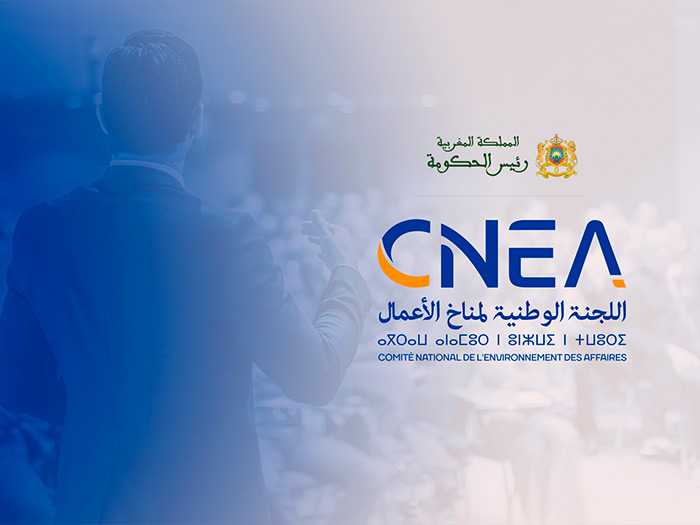
CNEA
Projet 2019
This logo, constructed from the acronym CNEA, is inscribed in a virtual rectangle evoking balance and strength of this institution which aims to promote Morocco's image internationally. An essential component of the graphic universe, the typography used was created with specific characters in order to underline the unique attribute of the latter. Its simple but refined composition expresses sobriety, strength, and modernity. The effect of white that crosses all the letters accentuates the image of movement, construction and continuity, like the actions that will be initiated by this body. In order to keep a maximum impact in terms of identification the two colors chosen, one bright and the other more intense, fit together perfectly and support the idea of a merger between the Public and the Private.
-

Ministry of Economy and Finance
Projet 2018
The new identity of the Foundation is ambitious. It projects the institution into its future vision and becomes the marker of a true renaissance. Designed around a symbol that reveals strong and honest values, this visual territory is based on a clean and statutory logo: this symbol created on occasion bears reassuring lines, harmonious curves and stars which represent an element of comfort. The result of meticulous design work spanning several weeks, it combines singularity and simplicity, and is intended to stand the test of time. Graffity envisioned the visual identity and branding of the Ministry Foundation, working for several months on the essence of the project. Our position in the face of such a challenge was to break away from visual commonplaces around an institutional image.
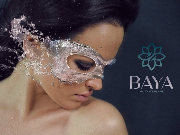
Baya House of beauty
Project 2019
We intervened on the whole of the preliminary branding at the launch of the new Baya brand: graphic chart, collection of pictograms, graphic standards, signage board ... to follow

Domaines Shama
Project 2019
We have been asked to redesign the visual identity of the domain. We capitalized on a typographic logo, entirely designed for the occasion, simple and elegant, but with subtle details ... to be continued

Calirra Jewelry
Project 2018
Graffity was commissioned to design a new visual identity for this Paris-based company. We opted for a simple and modernist language, based on the historical forms of diamond and on the ideas of precision. The new typography is built around a monogram thus forming a graphic identity sign.
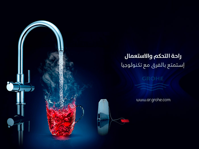
Grohe
Project 2018
Launch of the Grohe Middle East campaign in partnership with PUBLICIS PARIS
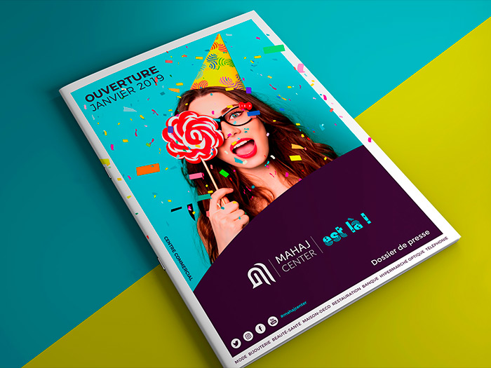
Mahaj Shopping Center
Project 2018
On the basis of the logo, we have developed in unison the universe graphics, color, visual and verbal Mahaj Center, to end on a design mixing vivacity, assurance and cheerfulness, it allows to vary the tone according to the supports. The new baseline of the brand